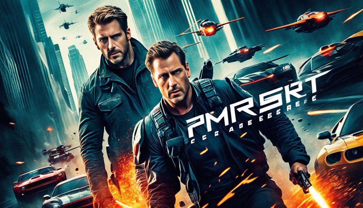
Movie posters are crucial for movie marketing. They capture a movie’s spirit with one striking image. If you’re eager to learn about movie graphic design or find Photoshop tutorials for movie posters, this guide has everything you need.
Designing movie posters means thinking about the genre, how to arrange everything, what fonts and colors to use for a great story image. Printed posters usually measure 27 by 40 inches, or 686 by 1016 mm. Their shape is slightly over 2:31. In places like bus stops, posters might be 40 by 60 inches, or 1016 by 1524 mm, keeping the 2:3 aspect ratio1. Retailers sell Architectural D posters that are 24 by 36 inches1. For the web, movie posters should fit many sizes, like Instagram’s 4:5 or a square, and Twitter’s 16:91.
If you’re looking for professionally designed movie poster templates, Envato Elements is the place to go. And for learning how to design film posters, check out Envato Tuts+ for helpful video tutorials and great examples.
Key Takeaways
- Movie posters encapsulate a film’s essence in an impactful visual.
- Standard sizes include the One-Sheet (27 by 40 inches), and the 40 by 60 inches for bus stops1.
- Adaptable templates are crucial for both print and digital media1.
- Envato Elements and Tuts+ offer resources for high-quality poster creations.
- Incorporate genre-specific elements to make posters more appealing.
The Evolution of Movie Poster Designs
The history of movie poster design is quite the adventure. It started with hand-drawn pictures and moved to advanced digital artwork. The very first movie poster was made by Jules Cheret in 1890 for a film event23. By 1895, films like L’Arroseur Arrosé were getting their own unique posters3. The 1920s brought a change, as posters moved from simple ads to real art with hand-drawn scenes23.
In the 1930s, posters changed to focus more on bold text and characters3. This was when Hollywood began to shine in silent films2. The 1940s and 1950s saw more photographs in posters, with famous actors front and center2. This time also introduced quieter text designs and character drawings3.
The 1970s were marked by bright, attractive poster designs. Designers worked closely with filmmakers to share a movie’s feel and message2. Now, photos became the main feature of posters, with text playing a supporting role3. The 1980s mixed large photos with text more evenly3. The 1990s brought digital effects, creating bold images and a set style with photos and actors’ names3.
The new millennium favored simpler, subtler poster designs3. With digital media, more movie posters are shared online to reach fans everywhere3. Cinemas now show digital posters with trailers and animations3. This digital shift makes traditional paper posters rare, moving everything online3.
Through the years, famous posters for “The Goonies” and “Indiana Jones” have influenced many others2. Changes in poster art highlight the role of text, visuals, and colors in sharing a film’s story and mood. Truly, the evolution of movie poster design shows how this art form has remained beloved and ever-changing.
Essential Elements of an Effective Movie Poster
Movie posters are key to promoting films, catching people’s eyes with their beauty. They highlight the movie’s title, stars, director, and when it’s coming out. Adding quotes or catchy phrases makes them even more appealing. Together, these details draw in and inform the audience.
A movie poster has to capture the film’s story, feel, and characters in one powerful image. Many modern posters use a simple style. This simplicity works well online, where images need to make an impact quickly1. Choosing a minimal look helps posters pop on crowded digital screens1.
Using striking colors and big, bold letters grabs people’s attention. The choice of colors sets the tone and tells us what kind of movie to expect2. Bold letters not only share the movie’s name but also add excitement to the poster2.
Putting together a movie poster means arranging everything just right. This includes using the rule of thirds to make the design appealing. Lately, the best posters mix attention-getting images, colors, and letters. This mix is key for catching eyes in today’s digital world2.
Exploring Different Movie Poster Sizes and Formats
Movie posters come in many sizes, each perfect for different marketing and display needs. Knowing these sizes helps make sure your movie poster looks its best.
Standard Movie Poster Sizes
The classic One-Sheet measures 27 by 40 inches, with a slightly more than 2:3 aspect ratio, used in theaters for eye-catching visuals1. The larger 40 by 60 inches poster is seen at bus stops and subways, designed to grab attention with its big display and 2:3 aspect ratio4. The Architectural D size at 24 by 36 inches is great for stores, offering a friendly size while still showing off detailed images1.
Smaller and medium sizes like A3 (11 x 17 inches) and A2 (18 x 24 inches) are also popular4.
Adapting Posters for Online and Social Media
Adapting movie posters for online use is key in today’s digital age. Each social media platform prefers different sizes: Instagram likes 4:5 for portrait and 1:1 for square, while Twitter goes for 16:9 in landscape1. Being able to change your design for these formats ensures your posters look right everywhere. This skill is vital for making sure your movie posters work well online and keep their punch.
Understanding standard movie poster sizes and online formats is crucial for designers. It allows you to create flexible and appealing visuals. This not only makes the movie posters more attractive but also makes sure they work well wherever they’re shown.
Leveraging Color in Movie Poster Designs
Color is key in movie poster design, setting the mood and genre. Color psychology in movie posters is crucial, as different colors can bring out specific feelings needed for the film’s vibe. Colors are chosen carefully to attract the right audience by making an instant visual link.
Color Psychology in Posters
Entertainment Weekly spotted a trend where movie posters use colors that pop together, like blue and orange5. These colors sit across from each other on the color wheel, offering striking contrast that catches the eye5. Most people, about 95%, think the choice of color is key in conveying the movie’s tone and stirring emotions in the viewer6.
Genre-specific Color Palettes
Action movies often show bright reds to express excitement, while horror films use black and red to make viewers uneasy. Studies show that 85% of top movie posters mix stunning visuals with interesting facts to draw people in effectively6. Duarte suggests using contrasts within familiar colors to stay on brand, yet stand out5.
The Role of Typography in Movie Posters
Typography is key in movie poster design, helping to share important info and enhance the poster’s feel. Over time, movie poster typography has changed from just sharing info to becoming an art form. This reflects the film’s style and genre7. The right typeface adds to the poster’s drama and mood, making fonts crucial for showing a film’s essence fast and clearly7.
Choosing the Right Fonts
Picking the right fonts for a movie poster means thinking about the film’s genre and the emotions the designers want to bring out. For comedies, popular fonts include Arial and Helvetica, often in red against a clean white backdrop8. Horror posters use Trajan font in bloody red with textures, adding a scary feel8. Sci-fi movies go for sans-serif fonts that glow blue, making edges look sharp and perfect8. For action movies, sans-serif, squarish fonts like Eurostile create a bold look8. Superhero posters use thick, bold fonts, adding 3D and metal effects for strength8.
Typography Trends in Movie Posters
Today’s movie posters use bold, thin, and action-packed fonts9. More available fonts let designers experiment, making a deeper emotional connection with bigger fonts and eye-catching designs9. Mixing visual elements with text, like blurring lines between them, is growing popular for its dynamic look9. Using balanced typography with images makes movie posters more engaging and tells a story.
Picking the right fonts and keeping up with trends is key for a poster’s success. It must catch the eye and show the film’s tone well. The way fonts in posters have evolved reflects changes in the film industry and media, underlining typography’s dual role in conveying information and art in movie posters7.
The Impact of Imagery and Illustrations
Movie posters use imagery and illustrations to tell a story quickly, showing what a film is about. The journey began with the first movie poster for L’Arroseur Arrosé in 1895. Now, these posters have become a key way to market movies2. In the 1920s, silent movie era, artists hand-drew posters. They gave theaters a big, beautiful way to show off upcoming films2.
By the 1940s and 1950s, photos began to dominate posters. This let studios show off their stars, adding to the poster’s storytelling power2. Posters like “Jaws” and “The Godfather” used strong visuals. They made a lasting mark and showed the power of great design.
Nowadays, movie posters mix many art styles. They range from simple to very detailed, fitting the movie’s story2. How colors and shapes are used is very important. Techniques like the rule of thirds make posters more interesting and beautiful2.
Research shows movie posters really influence what movies people want to see. A study with 40 people found that posters with bright colors and clear graphics grabbed viewers more10. Keeping the visual style consistent helps people get into the poster’s content easier. So, the best posters use images, colors, words, and layout well. They catch our eye and tell us quickly what the movie is about2.
Understanding Composition in Poster Design
A perfect balance in movie poster design is a mix of art and careful planning. Key principles like the rule of thirds and the right mix of words and pictures are vital. They make the poster not only beautiful but also engaging to the audience.
The Rule of Thirds
In poster design, the rule of thirds is essential. It suggests cutting the poster into nine equal parts with two horizontal and two vertical lines spaced equally apart. This technique helps in crafting balanced and eye-catching designs. By placing key elements along these lines or where they meet, designers highlight important parts of the poster. This makes it easier to spot leading actors or exciting scenes, creating a poster that truly stands out2.
Balancing Text and Imagery
Finding the right mix between words and pictures is crucial in poster creation. It’s important that one doesn’t overshadow the other. Words should enhance the images, leading the viewer’s eye smoothly across the poster. Using the rule of thirds properly can aid in this, placing titles and names in spots that boost rather than clash with the visuals. Achieving this balance is key for a unified and attractive visual story2.
Apart from the art, understanding what the audience likes is vital. For example, the use of blue and orange in action posters stands out for its contrast and vibrancy in the last 20 years2. It’s proof of how evolving trends in color, font, and layout merge to form a standout design2.
For deeper insights into current trends in movie poster design, check out this detailed resource on movie poster designs.
How to Draw Inspiration from Classic Movie Posters
Drawing ideas from classic movie posters can improve your design work. Watching the movie or reading the script lets you understand its themes and characters11. This helps in creating a better poster. Looking at old and new movie posters broadens your design ideas. It helps you make unique and meaningful posters11.
Old movie posters are treasure troves of design styles and methods. For example, funny movie posters use expressive photography. Action movies have dynamic layouts. These can inspire your designs greatly11. Learning from these posters honors their history and brings fresh ideas to your work.
Looking at other types of art, like paintings and photos, is also important11. They bring new textures, colors, and styles to your work. This makes your posters stand out. Mood boards with images and colors that match the movie’s themes help a lot11.
Working with other designers and movie fans brings new ideas11. It makes the design process richer. Trying different techniques and tools can lead to innovative posters. It pushes your creativity to new levels11.
Studying these tips helps you honor classic posters while adding your twist. This mix keeps your work fresh but familiar. Using these ideas can make your movie posters more powerful. They connect old charm with new creativity effectively.
Innovative Techniques and Trends in Modern Movie Posters
Today’s movie posters are full of new design ideas and current trends. They show the changing world of movie marketing. A big trend is minimalism. It uses simple pictures and words to make a big impact. This way, the movie’s main idea is shown clearly, making the design memorable. Also, using digital art lets posters show the film’s spirit in creative ways.
Now, typography is getting really creative. Designers mix words and pictures in fun ways to grab your attention. Since the 1920s, choosing the right font has been key to making posters work2. New techniques and digital effects give posters a fresh look, making them stand out as modern art.
Designers are also trying out new layouts to make posters look unique. They’re moving away from traditional designs. Films like “The Northman” have made cool character posters that mix actors’ names and images in new ways12. However, some movies like “She-Hulk” and “Don’t Worry Darling” stick to basic designs that don’t capture the movie’s spirit12.
Color is still very important in making a poster pop. The 1970s were all about bright colors2. Now, posters use colors that fit the movie’s genre to stir up feelings. Action movies might use blue and orange, while horror films choose dark colors like black and red2. The right colors set the mood and connect with the audience.

Interactive features in posters are becoming popular. They let people interact with posters in new ways. This includes augmented reality (AR) or QR codes that take you to more content online. The way movie posters are made is getting more exciting as it blends art, tech, and creativity. It shows us how movie posters can be more than just ads.
Creating a Cohesive Brand Identity with Movie Posters
Creating a cohesive brand identity with movie posters requires consistent design elements. These should be used in all promotional materials. This way, the film’s essence is clearly shown to viewers.
Consistency Across Promotional Materials
It’s vital to keep promotional materials consistent to create a united film campaign. Movie poster branding that matches makes the film instantly recognizable. This is true no matter where it’s seen.
Posters, social media, and trailers should all look similar. They need to use the same logo, colors, and fonts. For example, minimalist designs use few colors and lots of space to stand out. These can be used in different places without losing the film’s identity6. Also, posters focused on unique fonts and layouts bring the campaign together across platforms6.
Examples of Effective Branding
Effective poster branding shows how a steady visual style makes a stronger impact. Take event posters, which use bright colors to catch the eye and match the event’s theme6. Or, vintage-style posters, which bring back old-school feels with their design, fitting smoothly into wider campaigns6. “Stranger Things” is a great example. It kept an 80s look in everything from posters to merchandise. This created a full and engaging brand experience.
Pop art posters also make a big statement. They’re known for bright colors and bold graphics, echoing the pop art style6. Using these designs across promotions keeps the film’s vibe alive. Keeping designs consistent helps build a strong brand that audiences remember and enjoy.
For more on how poster designs impact branding, check out advice and examples from the pros. Visit branding through posters for in-depth guides.
Collaborating with Directors and Producers
Working well together in poster design is key to making a visual that matches what the director and producer want. Designers like Akiko Stehrenberger have helped on movies by famous directors like David Lynch and Sofia Coppola. This shows how important working together is to create memorable posters13.
Being part of the movie poster making process means getting the film’s big idea and mood right. It also means sharing those ideas with clients to make them better13. Doing this makes sure the final poster truly reflects the movie and connects with the audience.
The mix of different artistic styles is a big part of this teamwork13. It helps make sure the poster can hint at the film’s message in a simple but powerful way, a skill Stehrenberger is known for13.
Learning about poster design teamwork shows why it’s so important to work closely with everyone involved in making a film early on. Understanding everything about the film helps create amazing posters. These posters do more than just advertise the film; they make its visual story better.
Case Studies: Iconic Movie Poster Designs You Should Know
Iconic movie posters like “Star Wars: A New Hope” and “Jaws” show how to promote films brilliantly. They catch the movie’s spirit. These case studies explore the design strategies behind their fame and lasting impact.
Star Wars: A New Hope
The poster for “Star Wars: A New Hope,” crafted by Tom Jung, is a design triumph. It mesmerizes with a montage of the main characters. This draws viewers in instantly. Plus, it boldly displays the movie title, star cast, and director, setting a standard for film promotion1.
Its bright colors and dynamic poses give it an everlasting charm. This excites moviegoers greatly.

Jaws
Roger Kastel’s “Jaws” poster is unforgettable in movie marketing14. It’s famous for its simple, frightening picture of a huge shark approaching a swimmer. This image perfectly shows the movie’s horror and suspense. Its sharp contrast and strong design elements mark it as a milestone in iconic film promotion15.
Studying these posters gives budding designers key lessons in creating striking and impactful promotional content.
Conclusion
Movie poster design blends creativity, marketing, and graphic skills. We’ve looked at its history, important parts, and techniques. The type of movie, color choices, and font styles are key in making designs that catch attention and connect with people.
Posters come in many sizes like the One-Sheet and bus stop ads, each for different marketing uses1. Today, they also fit various online formats for social media1. This adaptability helps share a movie’s spirit widely, in print and online.
Designers like Akiko Stehrenberger and Jay Bennett show us it’s about mixing art and ads16. Teamwork between publicists and designers is crucial in making posters that touch viewers’ feelings16. Taking bold design steps can lead to big success. “Black Swan’s” artwork is a perfect example16. Movie posters are an evolving art that continues to amaze and engage us all.
FAQ
What are the primary elements to consider when designing a movie poster?
How has movie poster design evolved over the years?
What role does color play in movie poster designs?
What are standard sizes for movie posters?
How can designers adapt movie posters for online and social media platforms?
What should designers consider when choosing fonts for movie posters?
How do imagery and illustrations impact a movie poster?
What is the Rule of Thirds in movie poster design?
How can designers draw inspiration from classic movie posters?
What are some trends in modern movie poster design?
How can a cohesive brand identity be established through movie posters?
Why is collaboration with directors and producers important in movie poster design?
Can you provide examples of iconic movie posters and why they are effective?
Source Links
- https://design.tutsplus.com/articles/movie-poster-design-101-the-anatomy-of-a-movie-poster–cms-35852
- https://webflow.com/blog/movie-poster-design
- https://postercollector.co.uk/articles/history-of-movie-posters/
- https://www.linearity.io/blog/poster-sizes/
- https://www.duarte.com/cinematic-color-choices/
- https://fourthwall.com/blog/unveiling-the-canvas-a-creators-guide-to-effective-poster-designs
- https://www.atlantis-press.com/article/125923437.pdf
- https://www.printmag.com/article/typography-movie-poster-design/
- https://www.linkedin.com/pulse/more-than-words-art-typography-film-posters-adam-blakemore
- https://www.ncbi.nlm.nih.gov/pmc/articles/PMC9222334/
- https://posterspy.com/the-secrets-to-discovering-inspiration-for-movie-poster-design-5-tips/
- https://insessionfilm.com/try-harder-an-overview-of-modern-movie-posters/
- https://classiq.me/art-directing-film-posters-in-conversation-with-illustrator-akiko-stehrenberger
- https://posterhouse.org/blog/movie-posters-that-changed-entertainment-marketing/
- https://musebycl.io/film-tv/50-movie-posters-changed-entertainment-marketing
- https://letterboxd.com/journal/one-sheet-wonders-poster-art/